So here is what we have: a whole bunch of personal homepages where people would put a bunch of info about themselves, their favorite music, movies they liked, and other bits of personal chit chat and then sprinkle it with some favorite photos and links to their friends.
Sound like MySpace or maybe your favorite blog? Sure does. But actually that isn’t what I’m describing!
I’m describing an early incarnation of the web. Just before the ‘webosphere’ became mainstream and every company on the planet opened up an online shop, this is exactly what the web was. A bunch of folks, posting about whatever they thought was cool, and linking to all their friends.
It’s just interesting that after all these years and all the changes the internet has undergone, at its core it has remained a place where everyday people go to connect with one another. As a normal guy, I find this absolutely fascinating and I think it says something important about what it means to be human…
…and of course, as the Product Manager here at Ilium Software it reminds me to look hard at new trends and realize that underneath, there is often an element of human nature that drives them. Figure out what that hidden element is and you are on your way to producing a product that people truly want and need.
How important is appearance? Is it a vital part of any application design? Or just a nice thing to add if you have time for it?
There have been a couple of great posts about this subject today. One of them is at Just Another Mobile Monday and another at Treonauts. Both of these address the subject from the point of view of a user. I thought I’d take a second to discuss it from the developer end.
Creating a great looking app is actually something every developer (well, every developer I know anyhow) wants to do. Actually doing that, though, is something else altogether. There are plenty of roadblocks to making this happen.
Resources
This is an obvious one and it affects a lot of small software houses. Designing a really good looking interface takes time and money. If you don’t have the skill in-house, you need to out source and that requires a serious investment. …
Screen Real Estate
This is something both of the articles I mentioned talked about. Mobile software needs to take full advantage of the limited screen space mobile devices offer. The challenge here is that a good looking interface takes up space. While it can make the use of space more effective in some cases, more often it uses up screen space that cannot then be used to display data/content/etc..
Making it Work
Pretty is one thing. Pretty and functional is another. It is a serious challenge to come up with an interface that not only looks good, but also does its job! (Anyone remember the old IBM commercial where the guys were showing off the animated flaming logo on the website but the site couldn’t handle customer orders?)
“Microsoft Says…” Or “Palm says…” or “HP says…” There have been many times when we’ve wanted to do something a certain way, but in order to achieve that all important approval from the powers above us we had to do it in what we thought was a less effective way. (Ever wonder why so many Windows Mobile apps don’t have an Exit/Quit function?)
Planning for the Future
And last of all, when you put a beautiful interface like that onto a product, you’ve just set in virtual-stone how that product will work. Need to add a button for a new feature? Time to redesign the entire interface! Discover that the field isn’t big enough? Gotta order a whole new skin!
OK, so it’s hard to do and there is lots standing in the way. You probably get that by now. The question of course is how much should developers care?
In my opinion, a lot. A plain text data feed has its place but for those programs we use while we’re on the move, over and over throughout the course of our day, it has to be a product that treats us like human beings….not data processors.
For Ilium Software, this is something we are always looking at and as we move toward the future, it’s something that is becoming increasingly important in the evolving mobile software marketplace. It costs money. It costs time. But hopefully in the long run it will pay off.
Bach has a very good point when it comes to using those two concepts as ways to explain away a problem.
The article also made me think about how often I run into issues of common sense or intuition while providing tech support. Keep reading for some examples, and a little discussion on how I think the common sense and intuition pitfalls can be avoided.
Common Sense
Dictionary.com says: “Sound judgment not based on specialized knowledge; native good judgment.” [ link] This is a good definition, since the idea of common sense is that it’s common, or rather not uncommon. Take crossing the road. You look both ways, right? That’s common sense - if you don’t look, you get hit by a car. This is common because most people are taught it when they’re a child.
The problem is when you, me, or anyone else thinks that something is common sense, but isn’t. “ It’s common sense that to make a new file, you go to File -> New File, right?” No. One key part of tech support is instructing users on how to accomplish tasks. If the user doesn’t know how to do something, then thinking, “But that’s common sense!” is pointless. It’s only common to you.
A related problem concept is ‘obviousness’. I think the only way something can be truly obvious is if it is simply in plain sight and clearly delineated. If you say something is obvious and it’s not staring you in the face saying, “I’m obvious!”, it’s not.
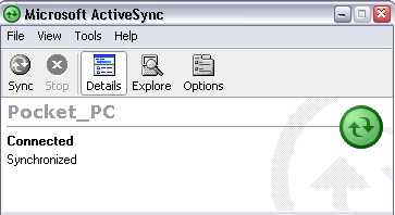
My favorite example is the picture below:
This is the Microsoft ActiveSync connection window, with a Pocket PC 2002 PDA connected. I’m not trying to pick on ActiveSync, but this happens to be a very common scenario that I have to deal with, and it’s a subtle one.
If you are familiar with Pocket PCs, forget that you’ve ever used one before. If you aren’t familiar with them, stay that way for the next 30 seconds.
Now, pretend that you’re on the phone with me getting help:
Me: “Okay, now I need to know the partnership name of your Pocket PC.”
You: “How do I find that?”
Me: “Open your ActiveSync window on your PC and you’ll see the name listed.”
You (more often than not): “Uh, where’s the name?”
Where is the name? Something is connected, and probably synchronized. Do you know where the name is?
The name is “Pocket_PC” - that’s the name assigned to your Pocket PC by ActiveSync, for use in identifying it in other software. That’s the piece of information I needed. Do I blame you for not knowing how to get it? Not at all. That piece of information is not obvious.
My solution for this obvious problem would be to place the following in front of the actual name text, so it reads Device Name: Pocket_PC . That way, if I ask you for the name of your Pocket PC, there’s a much higher chance you could look at the ActiveSync window and say, “Oh, it’s Pocket underscore PC.”
Obvious things are a kind of discoverable common sense. To learn not to walk blindly into the street, your parents had to tell you not to do it - you can’t really discover ’look both ways’ unless you want to get hit by a car. To learn how to save an article as a draft and keep writing it in WordPress, you hopefully just look down below where you’re typing and see the large button labeled “Save and Continue Editing” - in other words, you discover the obvious button.
From a tech support perspective, everything should be obvious - this helps maximize a user’s happiness with software and minimizes tech support for things that aren’t actually broken. Obviousness helps people develop their own common sense and helps them explore the software on their own.
Intuition
If common sense is something everyone is supposed to know, intuition is something no one knows. “The act or faculty of knowing or sensing without the use of rational processes; immediate cognition.” [ link] James Bach argues that intuition is really, “I don’t know how I did it,” and I agree with that definition.
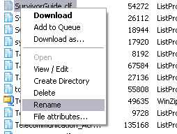
Sometimes it’s easiest to throw out a counter example - here’s the file menu I see when I’m right-clicking a file in my FTP client to rename it to a backup copy:
What’s wrong with this picture? Let’s say that wasn’t SurvivorGuide.clf, but instead ThisFileIsSoImportantYouWillDieIfYouDeleteIt.ext . Let’s say you sneeze right before clicking ‘Rename’. What other option might you click? DELETE.
You could argue that this is not an intuitive thing to do - it’s counter-intuitive. But what’s the reason? Well, because. Maybe it’s a bad idea to put delete next to a very innocuous thing such as Rename. It just feels funny, at least to me.
Part of tech support involves fielding feature requests. A user decides that it’d be easier to use OurProduct if the Widgets are configurable by right-clicking on them, and so they send something along which gets to me. But why is it any better to have right-click on Widgets? Sometimes the user gives a really good explanation, but other times, it’s just, “I like it better that way.” It’s like explaining why you like pistachio ice cream - you just do. I could implement my GTD organizational system using Microsoft Outlook, but I don’t like the way Outlook works, and for the most part I don’t know why. Other options just feel better.
When users can’t use our software, I want to know why. It’s in my best interest to figure out what the problem is, since I’ll be helping people with it when it becomes a problem. Are we assuming users know something that they really don’t know (“it’s common sense!”)? Are we ignoring an easy way to make things ‘feel’ right for users (“it’s not intuitive unless the category tree’s on the right!”)?
It’s all very linked together. Users come to technical support with problems, technical support goes to the developers with common problems, developers fix the problems and refine the software, users take the refined software and find more problems.
One thing I’ve noticed in terms of support is that people usually come to us wanting to make lists (ListPro), keep track of passwords and such (eWallet), keep track of financial transactions (Keep Track), but when it comes to NewsBreak, it’s a bit up in the air. It lets you… read news! Specifically, it’s an RSS feed aggregator, and if you know what RSS is, you understand the concept immediately.
If you don’t know what RSS is, wrapping your head around just what NewsBreak is good for, can do, can’t do, etc. can be a little tricky. If you don’t know what RSS is, this article will probably help: A non-technical explanation of RSS.
I really love those parenthetical titles! The software industry - and in fact anyone who wants to sell something - is driven by either addressing customer needs and wants, or trying to invent a need/want so that customers will buy a product.
Push email is a good example. Do you need it? Maybe. Does everyone need it? Probably not. Do you want it? Maybe. Do you need it because you want it, or because your job depends on you actually being able to respond to an email within one minute even when you’re taking a pit stop? That depends entirely on you and your boss. Or do you want it because someone says, “Push email is big!” [Incidentally, here’s an article about why Push Email may not be so great over at Modern Nomads that touches on the issue of want vs need.]
This post is about screen resolution. Screen resolution has gone up fairly steadily over the years. My parents’ first computer had a 15" CRT monitor that cost $500 and could just barely handle displaying 1280x1024 resolution at eye-melting 60hz. Now, a 19" CRT that can easily do the same at readable 85hz costs $90 from OfficeMAX. The 17" LCD I’m using right now can easily support that resolution natively and cost about $200 - a similar one I just sold that I’d purchased in May of 2004 was $440. When my parents bought their first computer, the whopping 30" Apple Cinema Display was completely unheard of as something a mortal could purchase, but now Dell has equivalently-sized displays that aren’t so crazy. Television screens used to be the size of a small toaster - today, even a college student can afford a plasma display (your college student may vary.)
We want bigger, we can have bigger, so we get bigger. What about PDAs? Instead of getting bigger, we want smaller. Witness the relative explosion of the Smartphone market as opposed to the palm-sized handhelds of various flavors. Smartphone devices are pretty cool any way you slice them - except for one thing.
The screen is really small! All Windows Mobile 5 Smartphones use ‘QVGA’ displays, 320x240 pixels. However, these phones don’t display any more data than the previous 176x220 displays - they just make it look prettier with more pixels. The same goes for VGA Pocket PCs, or high-resolution Palm-powered handhelds - a 640x480 Dell Axim X51V can’t display any more data on the screen than the 320x240 Axim X5 could, nor can my Treo 650 put anything more on its 320x320 screen than the original Palm could with its 160x160 screen.
It really is possible to cram more data on the screen - you just use a smaller font size. We get requests all the time - especially for ListPro - to add ‘high resolution’ support to our applications. The way I’ve seen this done, the screen font size is halved. My DateBk6 program on my Treo 650 can do this easily. The problem is… I can’t do it. I’m young, and even though I am nearly legally blind without my glasses, I can see pretty well with them on. That doesn’t make reading characters any easier when they’re as big as this period –> . [For a look at how this works out on ultra-portable and UMPCs, take a look at this blog post by JKOntherun]
We want smaller and bigger at the same time - smaller dimensions, higher resolutions. “QVGA is too small! It’s too ugly low-res!! Why would I want a Treo 700w when the screen is only 240x240! I want more pixels! More pixels! 10 megapixel cameras! XGA Pocket PCs!
Do people really need these tiny screens? Do people really want them? Are they being told they want them by marketing? Are they assuming that more pixels is better? Tech people aren’t immune to ‘more is better’ - I bought my new digital camera partly because it was just $20 more to get 7.1 instead of 6MP! Why get a regular value meal when you can biggie size it (disclaimer: biggie sizing no longer exists at Wendy’s) for just 40 cents more? Why get an Axim X51 (320x24) when you can get the X51V (640x480, four times as many pixels) for less than $100 more?
So what do we as a company do? Do we spend a lot of time adding a feature to our software just to make it more flexible, giving people the option to squint at their 2.5” screen to see 300 lines of text instead of 150 (disclaimer: I made that number up.) Do we have to climb on that bandwagon in order to make sure we stay relevant? Or do we try to make software that is easily used on a 2.5" screen by people with average fingers and average eyeballs?
I certainly don’t have the answer. I would love to be able to see more of my shopping list in ListPro on my Palm, but I don’t think I’d be happy trying to check off “Get eye exam” using my thumbnail when my nail’s thicker than the item I’m trying to poke on the screen. Maybe the ideal solution is a compromise - give people all their data when they want it, and readable data when they need it.
Michael Mace wrote another great post (I’m a huge fan of his) about 4 tests that a mobile application has to pass in order to be successful: meeting a real need, being easy to install, being easy to learn, and being something the user is aware of.
User awareness is our biggest problem as mobile software developers. Many, if not most, users are completely unaware that third-party software even exists for their handhelds. Or maybe are just peripherally aware of it - if you ask them if they can buy programs for their Palm handheld or smartphone, they’ll say something like “I guess”, but it’s clear that it’s not something they think or care about. For everyone like Michael Mace, who thought about a Palm application as a solution to his problem, there are probably a hundred who’d never even think to look for one.
Need, as opposed to want, is so interesting to me. A while ago, Handango ran a survey of its members, asking what kinds of applications they wanted for their handhelds. ISVs at their Summit got a copy of the results (probably under NDA, so please don’t ask me for a copy). I spent a fair amount of time looking at the results, and looking up the applications people said they wanted. Nearly all of them were already available. While Handango’s search wasn’t that great (they’ve since improved it), I’m fairly sure that the respondents just didn’t really want the apps enough to buy, or even look for, them. It’s the “real need” that Michael mentioned. There are many things that I want, but not quite enough to spend the time or money on them. I want to look a lot better, but apparently not enough to spend the time and money on what it would take. I’ve got a few dozen CDs on my want list at lala.com, but apparently I don’t want them enough to just buy them on eBay or Amazon.
Did Michael need Big Clock enough that he would have paid for it if it hadn’t been free?
I don’t have much to say about the ease of installation and learning, except that those apply much less to the early adopter / techno-geek people (Alan Cooper’s apologists), who probably prefer apps that are a little more “challenging”, and so keep fooling us ISVs about what’s going to be popular with most people.